BRIEFING
Visual Identity for Microsoft Summer E-fest for @Microsft Portugal | 2020
Visual Identity for Microsoft Summer E-fest for @Microsft Portugal | 2020
Every summer Microsoft Portugal throws a party for all its members and collaborators.
But in 2020, in the middle of a pandemic, a party was not really an option. So we decided to do something bigger: an e-festival.
But in 2020, in the middle of a pandemic, a party was not really an option. So we decided to do something bigger: an e-festival.
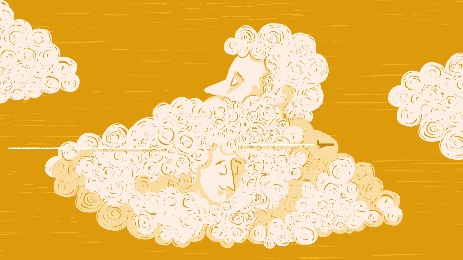
An 100% digital event hosted on Teams platform, with several concerts and activities, meant to strengthen relations and boost the team’s morale, in a time where everyone is working from home.


BRAND IDENTITY
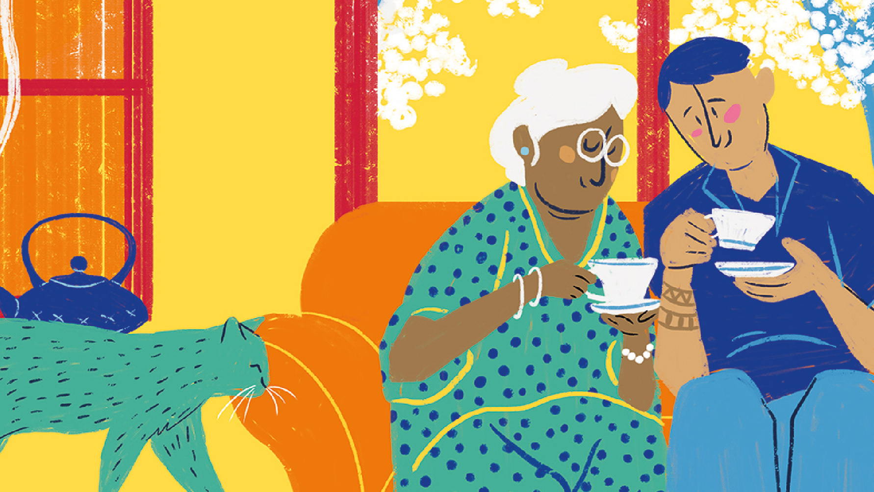
Built around a Totem, a symbol of collectivity, the branding evoked a summer festival vibe while showcasing the brand's colorful palette and iconic symbol.
And because no festival is completed without a drink, every participant received a cocktail kit, made from scratch to deliver every ingredient they needed to have a great night and a great toast to the brand’s 30th anniversary in Portugal.


CREDITS
Client: Microsoft Portugal
Creative Director: Anne-Laure Chauvin
Brand strategist: André Mateus
Brand strategist: André Mateus
Designer & Illustrator: Maria Carlos Cardeiro
Motion: Maria Carlos Cardeiro
Project manager: Inês Menezes
Artworker: Andreia Felicio
Artworker: Andreia Felicio
All rights reserved to NOSSA™ & Faz MOSSA 2020